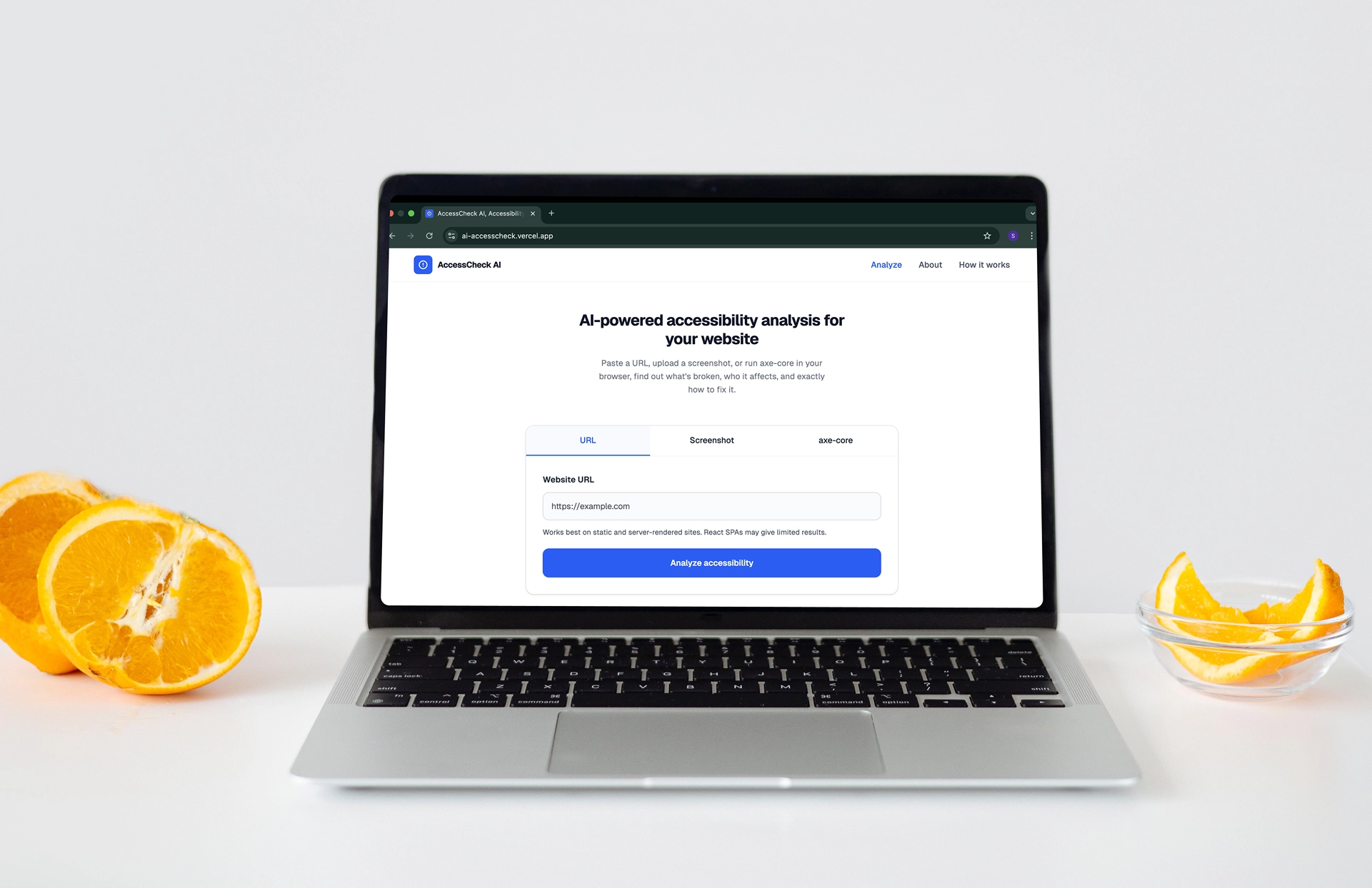
AccessCheck AI
An AI-powered tool that analyzes content and highlights accessibility issues, helping designers and developers create more inclusive user experiences.
View Live DemoProject Overview
AccessCheck AI is a portfolio project I built to explore how AI can make web accessibility more approachable for people who are not experts. Most developers and designers know accessibility matters, but the tools available today assume a level of knowledge that most teams simply do not have. I handled the full scope: product thinking, UX design in Figma, visual design, and full-stack development in Next.js with the Gemini 2.5 Flash API.
The Problem
The European Accessibility Act came into effect in June 2025, requiring many digital services to meet WCAG 2.1 AA standards. Despite this, accessibility is still treated as a late-stage checklist by most teams. Automated scanners output raw technical violations that mean very little to someone without an accessibility background. Manual audits are thorough but slow and expensive. Neither option helps someone who just wants to understand what is wrong with their site and how to fix it.
Key Insight
The problem is not information, it is translation. Plenty of tools can flag that an element is missing a label. Very few explain that a blind user will reach that button, hear nothing, and have no idea what it does. But surfacing the right information is only half the problem. The other half is making sure users can actually interpret and act on it. AccessCheck AI was built around both: every explanation starts with the user experience, and every finding ends with a concrete, copy-paste fix.
Why It Matters
Inaccessible interfaces do not just affect users with disabilities. They create friction, reduce clarity, and exclude entire groups from completing basic tasks. Catching these issues early, before a product ships, reduces the cost of fixing them and leads to better outcomes for all users. A more accessible product is almost always a more usable one.
Target Audience
The tool was designed for anyone who works on the web and wants to build more accessible products, without needing a WCAG background to get started.
- Developers who want actionable code fixes without reading the spec
- Designers who want to catch visual issues before handoff
- Product owners who want a quick read on their product's accessibility health
- Students and junior developers building their first production interfaces
Design Approach
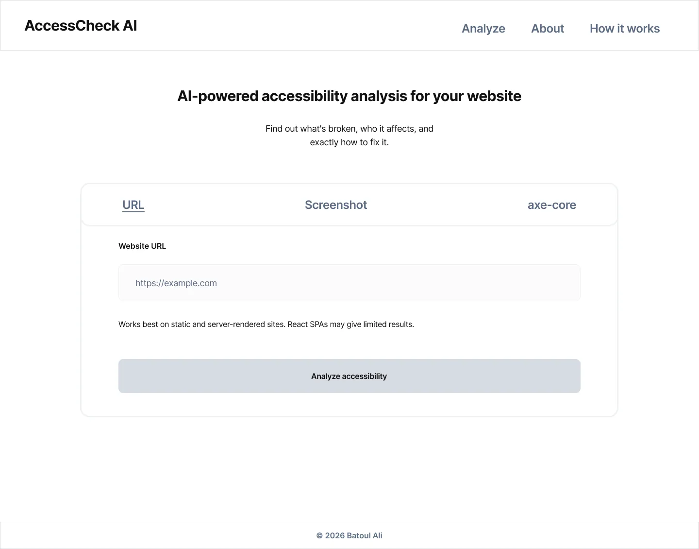
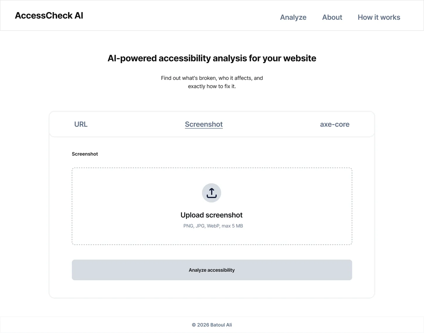
Before writing any code, I mapped the full interface in mid-fi wireframes to settle the structure first. Three input methods rather than one was the first structural decision: URL analysis, screenshot upload, and axe-core paste each target a different layer of the problem, and different users arrive with different starting points. Forcing everyone through the same entry point would have made the tool less useful for most of them.
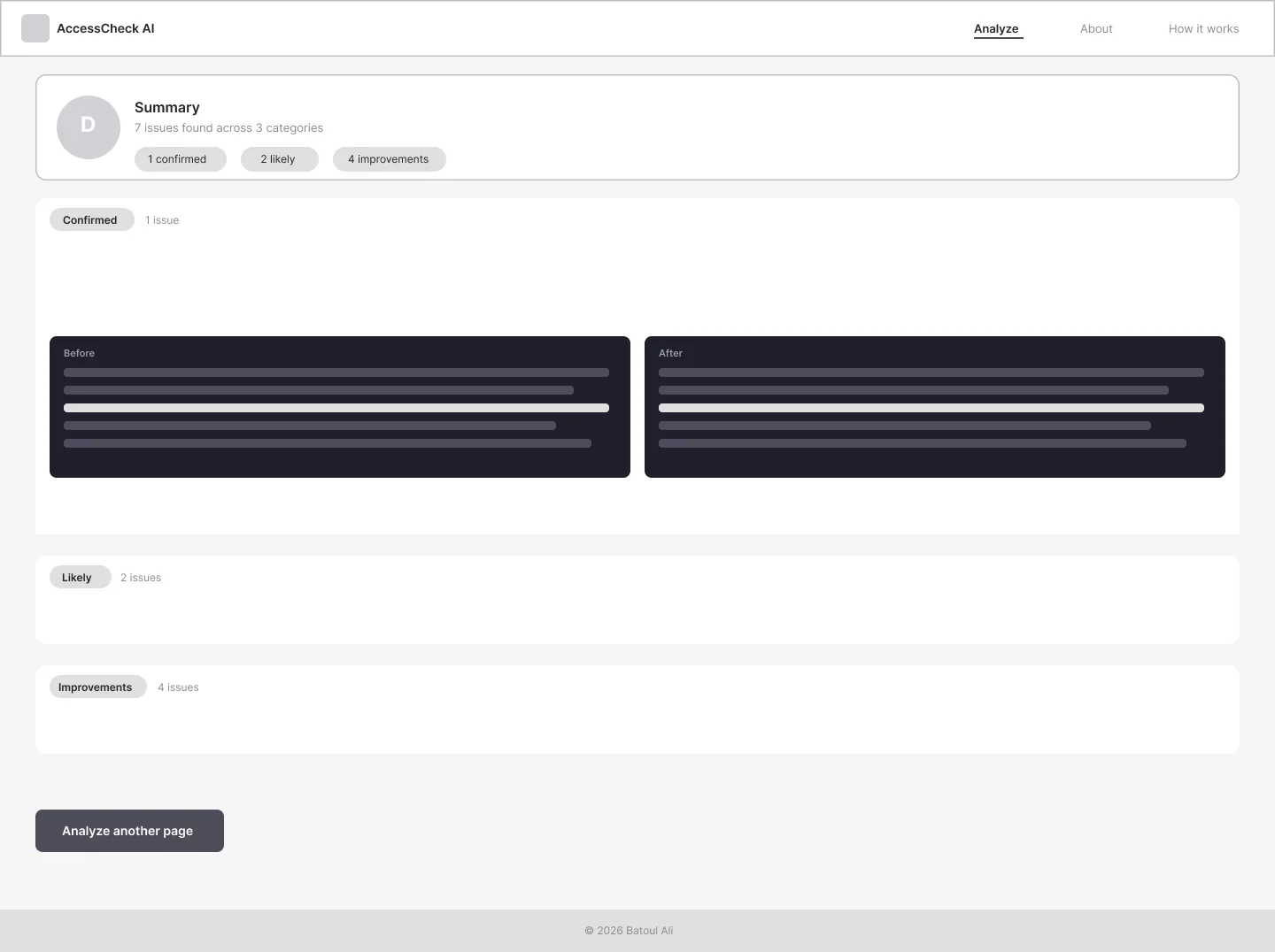
The results layout went through several iterations. A flat list became unreadable beyond four issues and gave no sense of priority. The solution was grouping findings by category; Confirmed, Likely, Improvements, collapsed by default. The A to F score reinforces that hierarchy: the first thing you see is how serious the situation is, not a wall of individual problems. Color coding across categories lets users scan without reading every label.
A consistent focus throughout was reducing cognitive load. The interface was built to guide users step by step, present only what is relevant at each stage, and never require prior accessibility knowledge to understand the output.
The Save as PDF and Analyze another page buttons came directly from user testing. Several testers asked how they could share results with a colleague, and others wanted to run another analysis without scrolling back to the top. Both are a direct response to observed behavior, not assumptions.
Visual Design
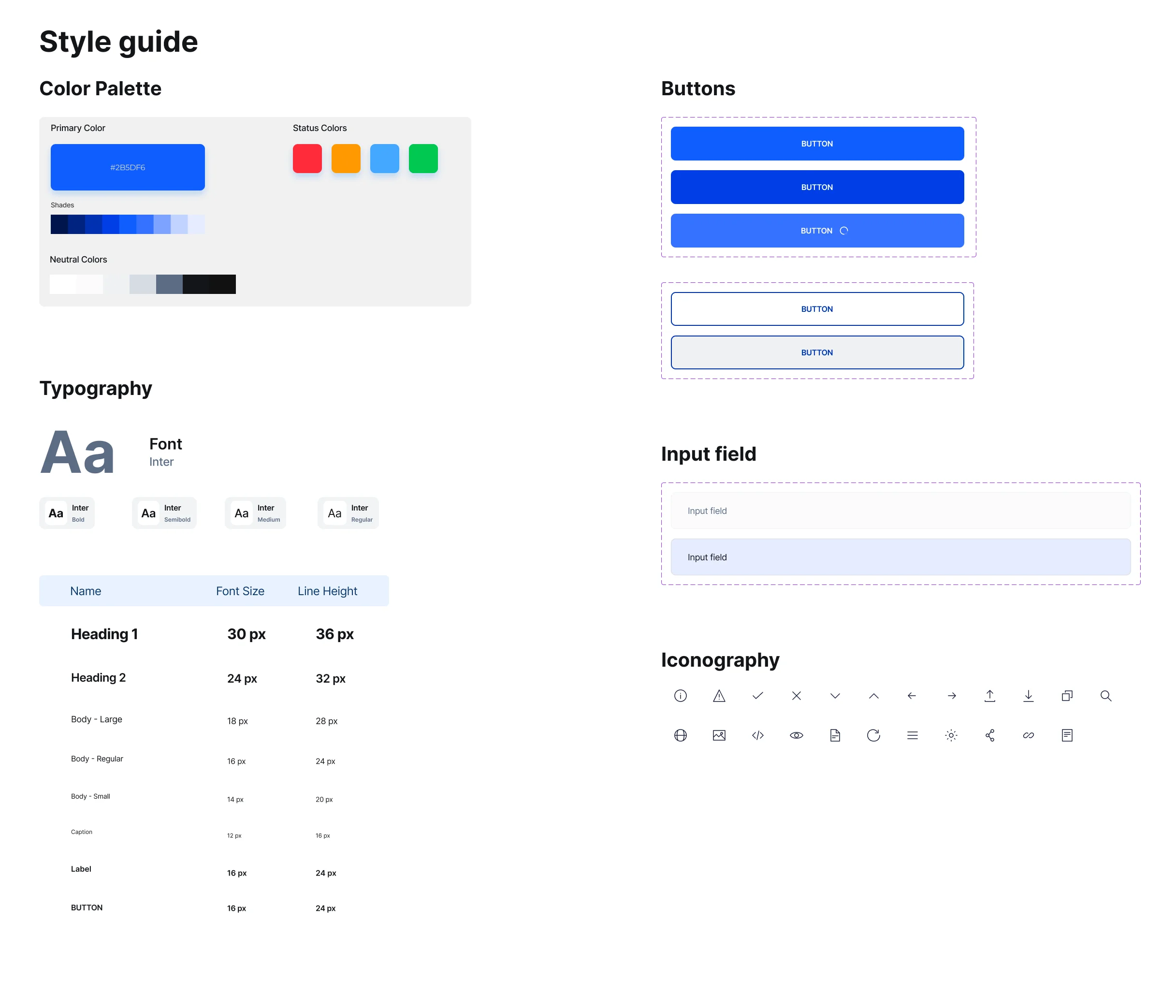
With the structure validated, I moved into the visual layer. The first constraint was self-imposed: a tool built to surface accessibility issues has to meet those same standards itself. Every color combination was checked against WCAG contrast requirements. Interactive elements were sized and spaced for easy targeting. The result structure used color not just for aesthetics but as a functional signal, with distinct hues for Confirmed, Likely, and Improvements categories so users could parse the hierarchy at a glance without reading every label.
The overall aesthetic was kept deliberately restrained. A neutral base with one primary accent, clean type with a clear size scale, and generous whitespace. The reasoning was straightforward: the interface should feel like a professional tool, not a product trying to impress. When the output is dense and complex, the surrounding chrome needs to stay out of the way. Any visual noise competes with the information users are trying to read and act on.
Typography followed the same logic. Inter was chosen as the sole typeface, a font designed specifically for screen readability, with strong legibility at small sizes and a neutral character that does not compete with the content. Weight and size do the work of hierarchy instead of color or decoration. The goal was that a user scanning results could immediately tell what was a heading, what was a finding, and what was a code example, without having to re-orient themselves each time.
The Solution
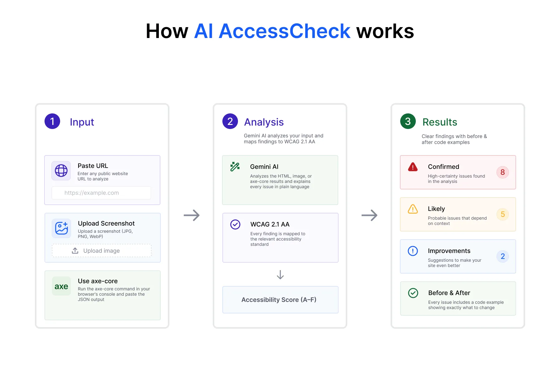
Three analysis methods, a confidence-tiered result system, plain-language explanations, before-and-after code examples, and an A to F score. The focus was not only on what the AI outputs, but on how users interpret and act on it. Every finding is structured the same way: what the problem is, who it affects, what the code looks like now, and the minimal change needed to fix it. That structure exists to reduce ambiguity and make the output immediately usable, not just informative.
The AI prompt was written like a style guide: every explanation must start with the real user experience, words like semantic and programmatically are explicitly banned, and the confidence level must reflect what can actually be proven. Getting Gemini to follow those rules consistently required significant iteration. The fix was making constraints tighter, showing the AI not just what to say but what not to say.
Feature Walkthrough
Three-Method Analysis
URL, screenshot, and axe-core inputs each target a different layer of the accessibility problem. The URL method fetches the page HTML for a structural review. Screenshots surface visual issues that code alone cannot confirm. axe-core runs real browser tests and only reports confirmed violations. Offering all three means the tool is useful regardless of what stage of the process you are in.
Before and After Code Examples
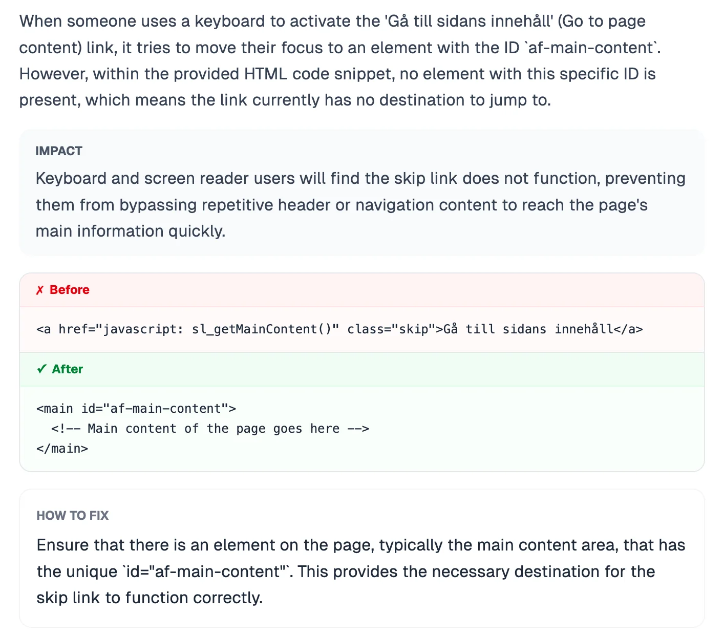
Every issue that can be traced to a specific element includes a side-by-side code comparison. The before shows exactly what is in the code. The after shows the minimal change needed to fix it. Most accessibility tools leave the fix as an exercise for the reader. The before-and-after removes that gap.
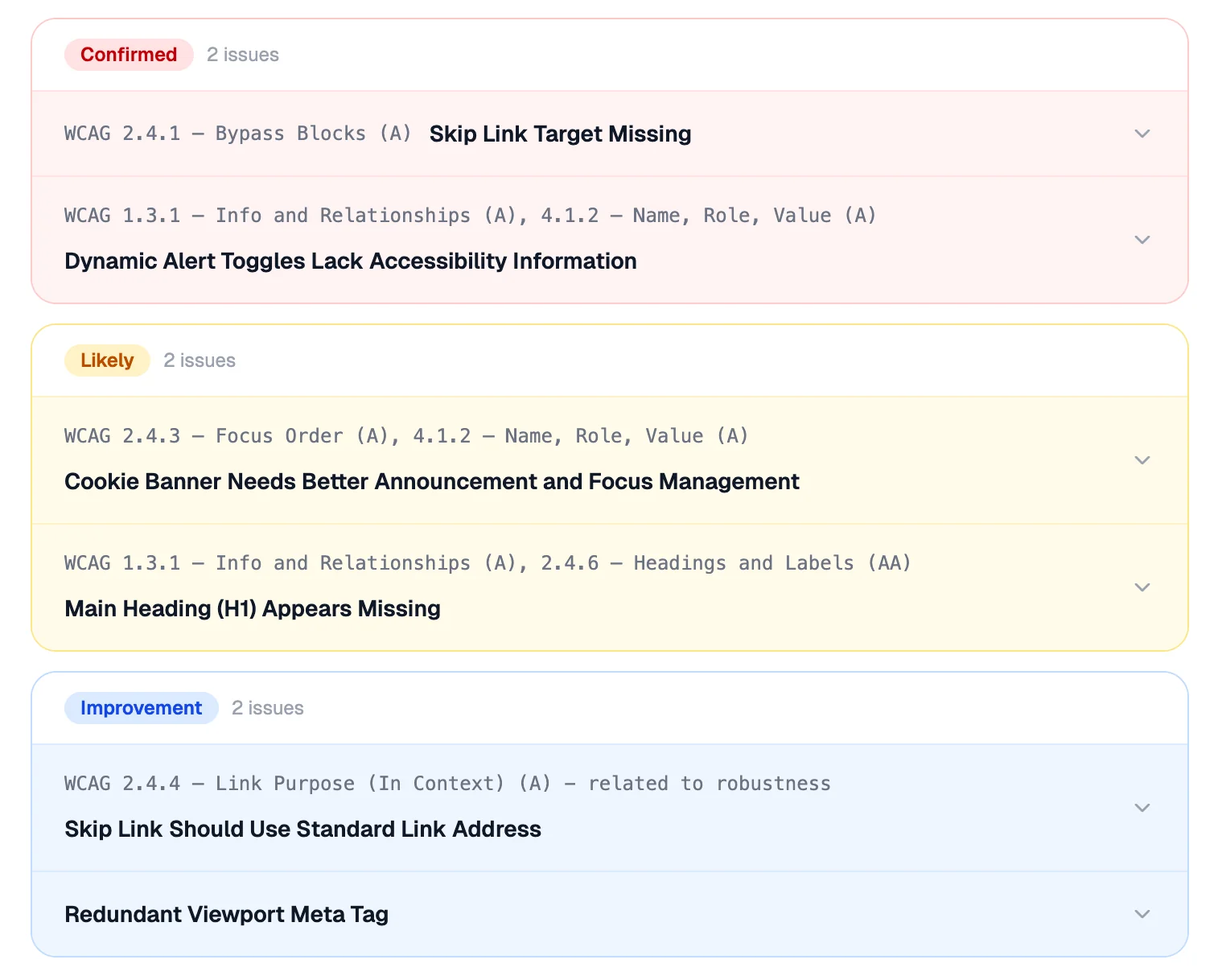
Grouped Accordion Results
Results are organized by category with each issue collapsed by default. This lets users scan the full picture before diving into detail. The first impression is a score and a summary. The detail is one click away.
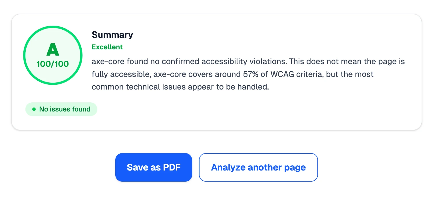
Export and Next Steps
After every analysis, Save as PDF exports the full report via the browser print dialog. Analyze another page clears the result and returns focus to the input immediately. Both features came directly from observed behavior during user testing.
Impact
The tool was validated with five people who had little to no WCAG knowledge: two developers, a graphic designer, a marketing professional, and a design student. The core goal held up. Plain-language explanations landed consistently across the group, and both developers described the before-and-after code examples as immediately actionable, exactly the translation from finding to fix the tool was built around.
Not everything worked first time. The A to F score caused confusion in two cases, with users reading a C or D as the tool performing poorly rather than the site, so the framing was adjusted as a result. The axe-core tab was the highest-friction point for non-developers, so the step-by-step guidance was rewritten to be more explicit. Both rounds of changes came directly from what was observed in the sessions, not from assumptions made at the desk.
Reflection & Learnings
The hardest part was not the interface or the API, it was getting the AI to behave consistently. A prompt that works on a simple landing page breaks completely on a complex government portal. The fix was making constraints tighter, not more detailed, fewer possible outputs, stricter rules, explicit examples of what the output should not say.
There are real limitations worth naming. The URL method only reads server-rendered HTML, so React and Vue heavy sites appear nearly empty to the analyzer. Screenshot analysis cannot verify what is in the code. axe-core is the most reliable of the three inputs, but asking a non-developer to run it in the browser console is a barrier most will not clear.
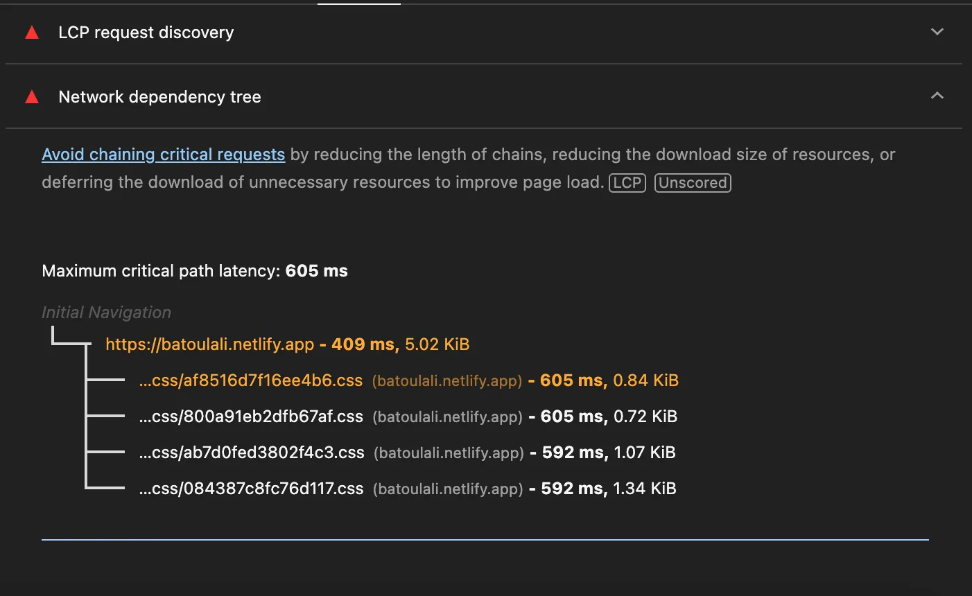
These are what I am actively working on. The highest-impact change would be replacing the URL fetch with Puppeteer or Playwright so the page actually renders before being analyzed. For screenshots, calculating contrast ratios from real color values would replace AI estimation with a verifiable number.
The user testing sessions were the most useful part of the whole project. Two people misread the A to F score as rating the tool rather than the site, which I would never have caught working alone. I would run testing at the wireframe stage next time, when changes are still cheap.